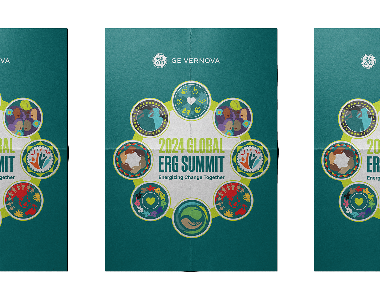

As a Social Media Coordinator in the 23/24 school year, I designed most of
the social media advertisements and led the creation of our rebranded visual identity,
which continues to be used after my departure.
the social media advertisements and led the creation of our rebranded visual identity,
which continues to be used after my departure.
Check out our Instagram!
Old Branding Compositions


New Brand Guidelines
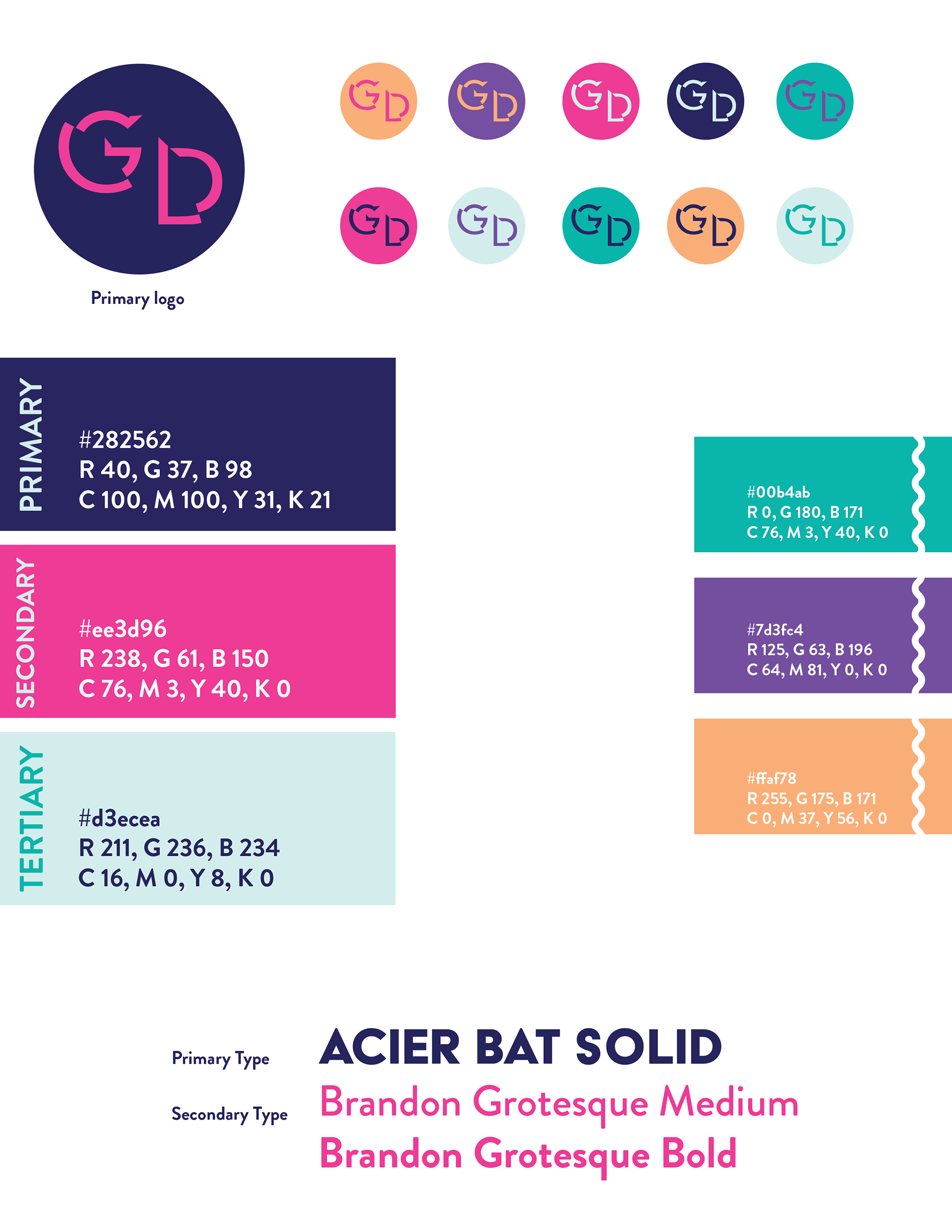
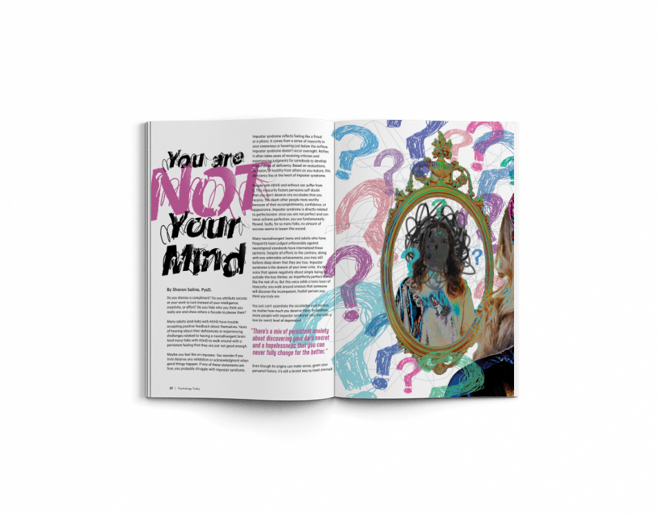
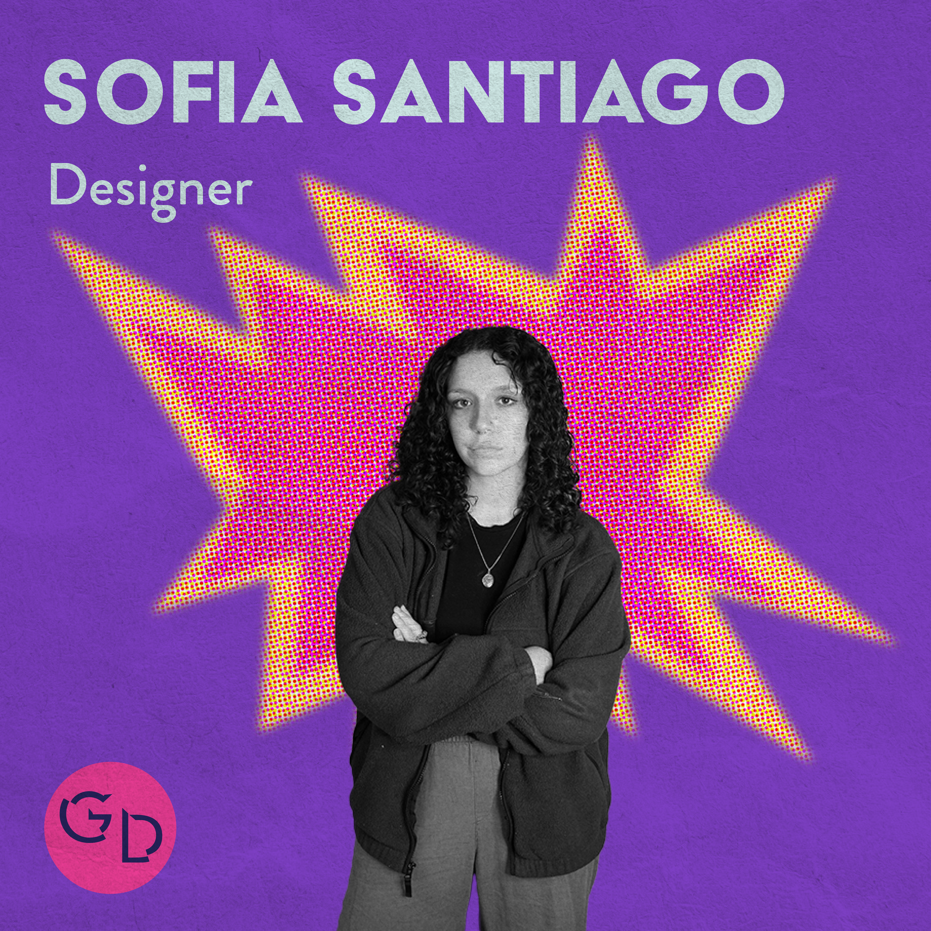
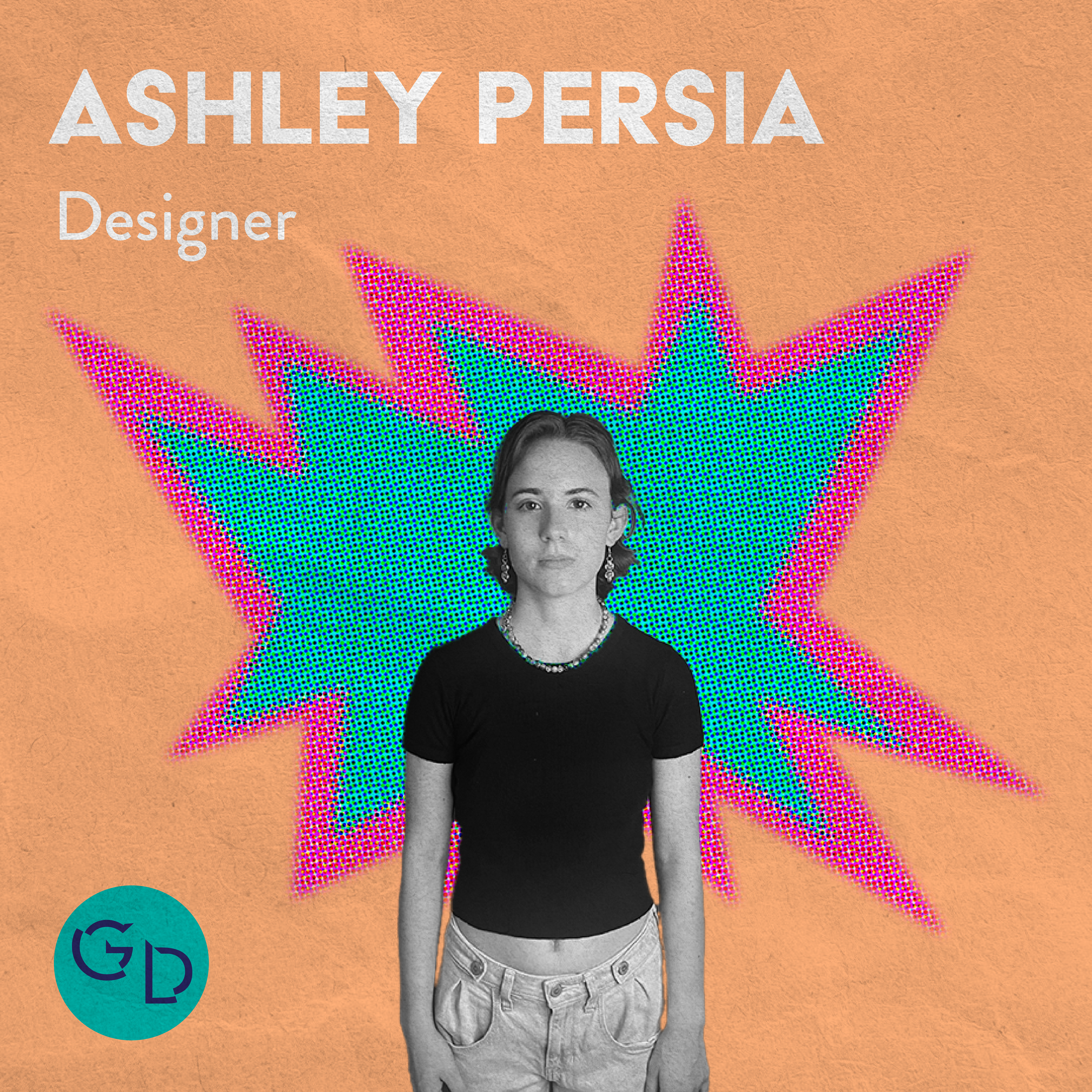
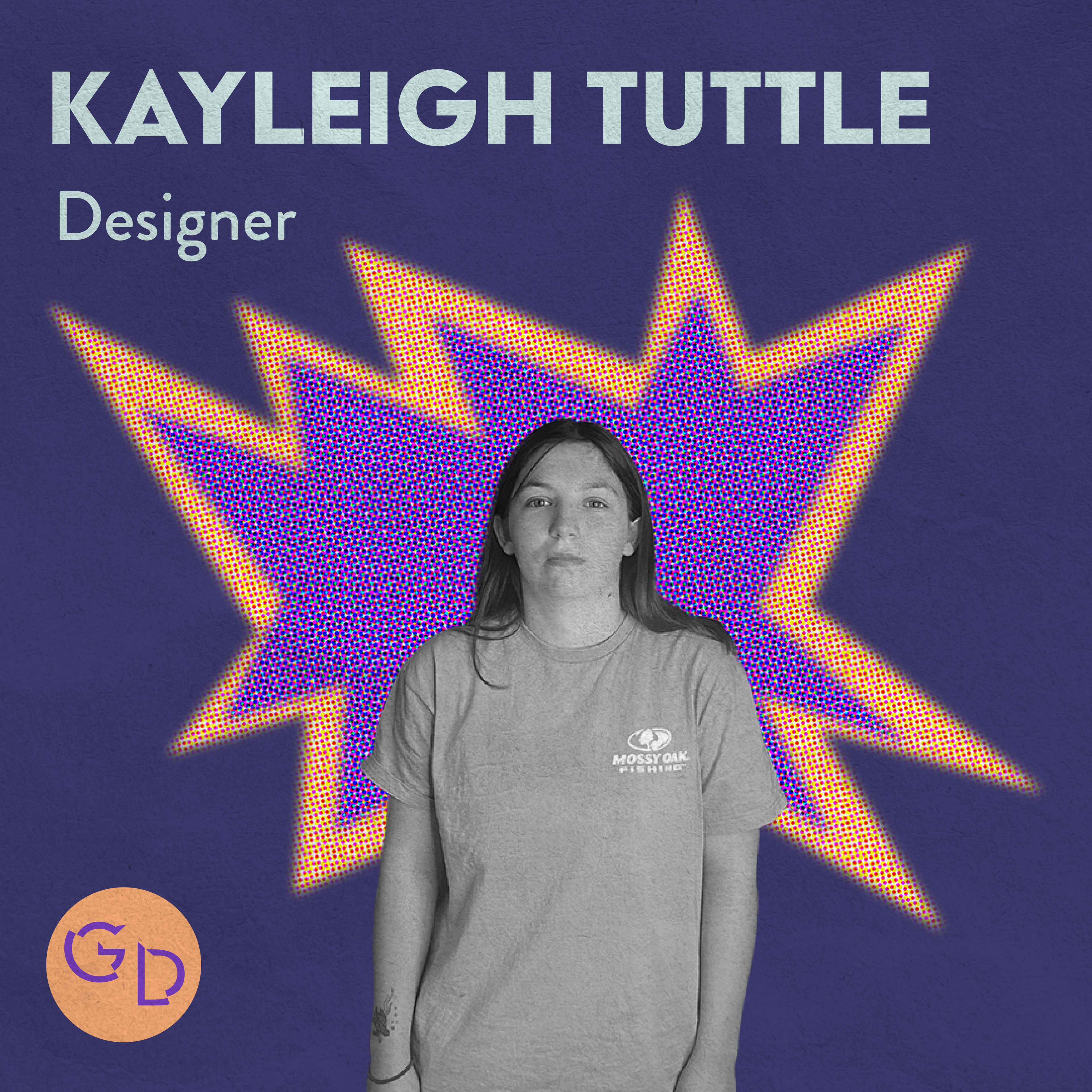
For the 2023-2024 school year, the new Social Media Coordinators wanted to gain more attention to the club's social media. The previous branding done by the prior social media team, was not gaining the attention of newer students. We believe the best way to engage our audience, is to design for them. Our rebrand included the use of vibrant colors, textures, halftones, and photo to advertise the club in a more intriguing and engaging way.
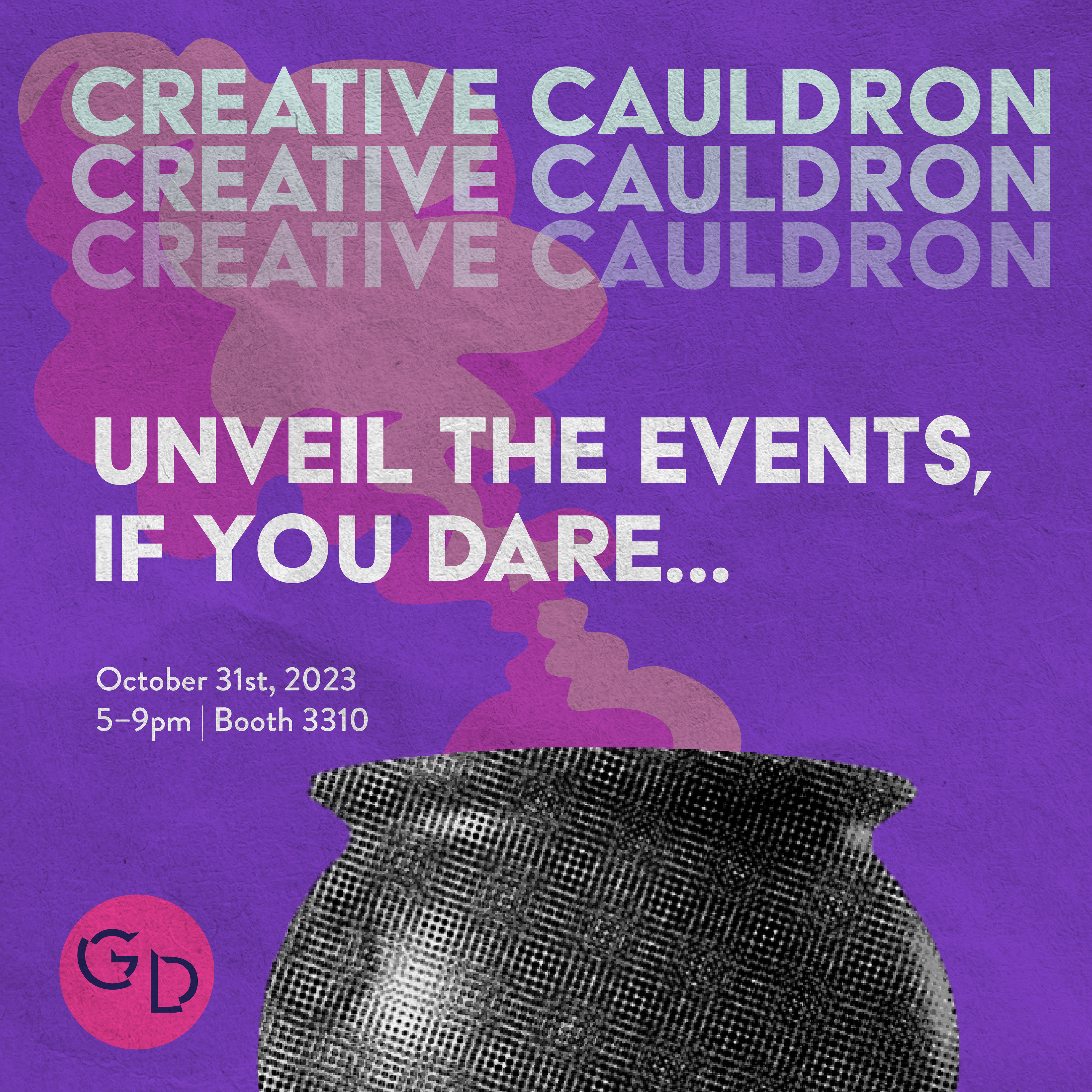
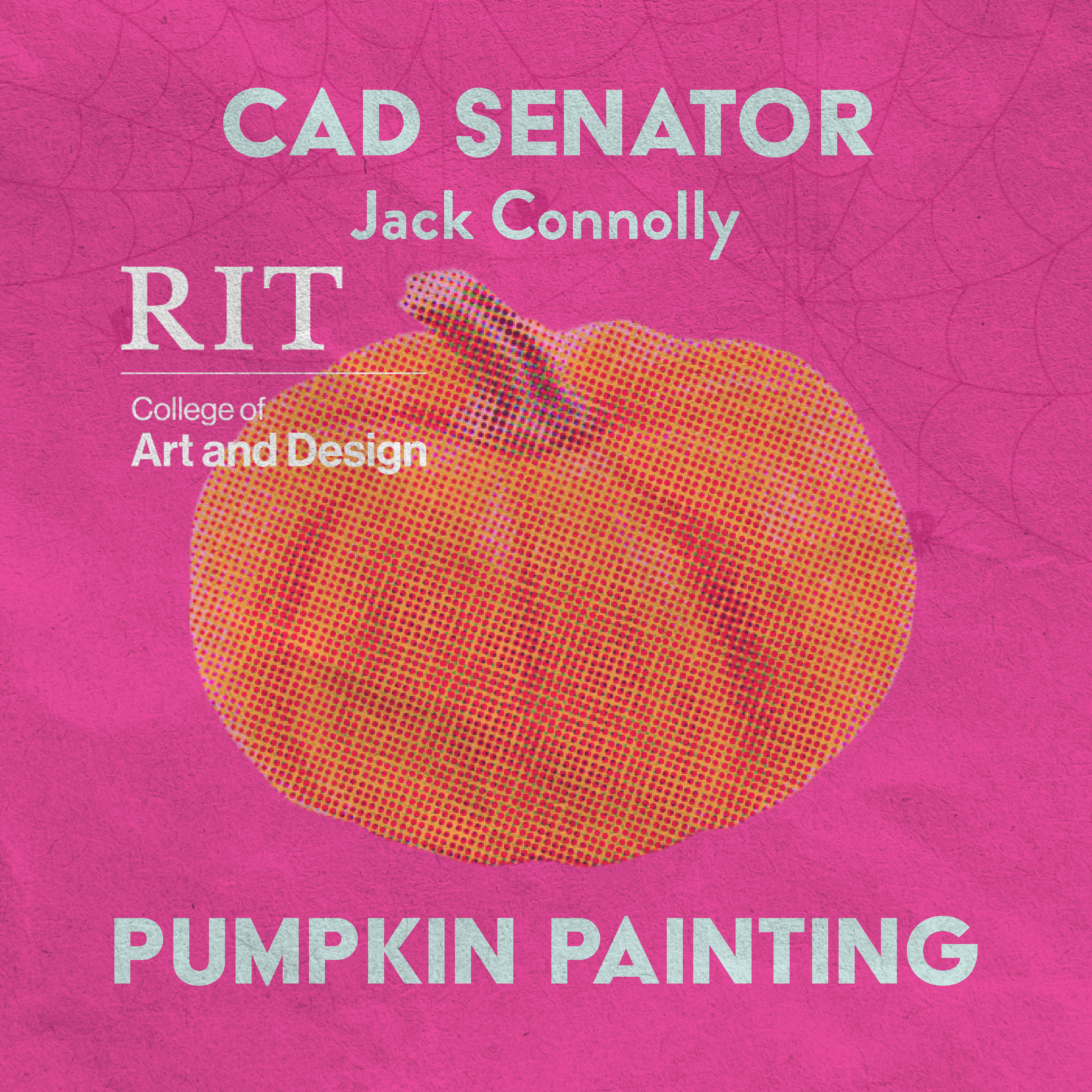
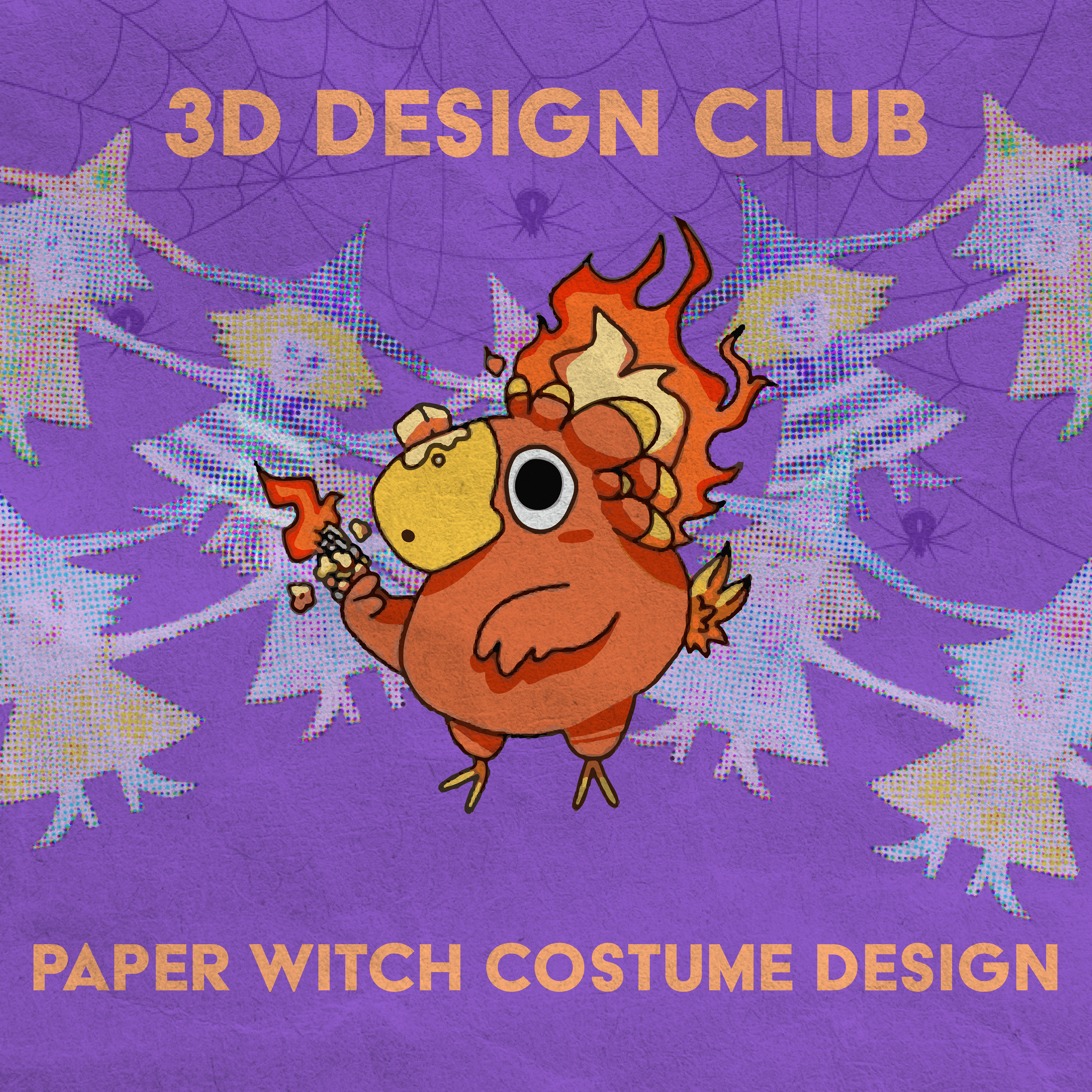
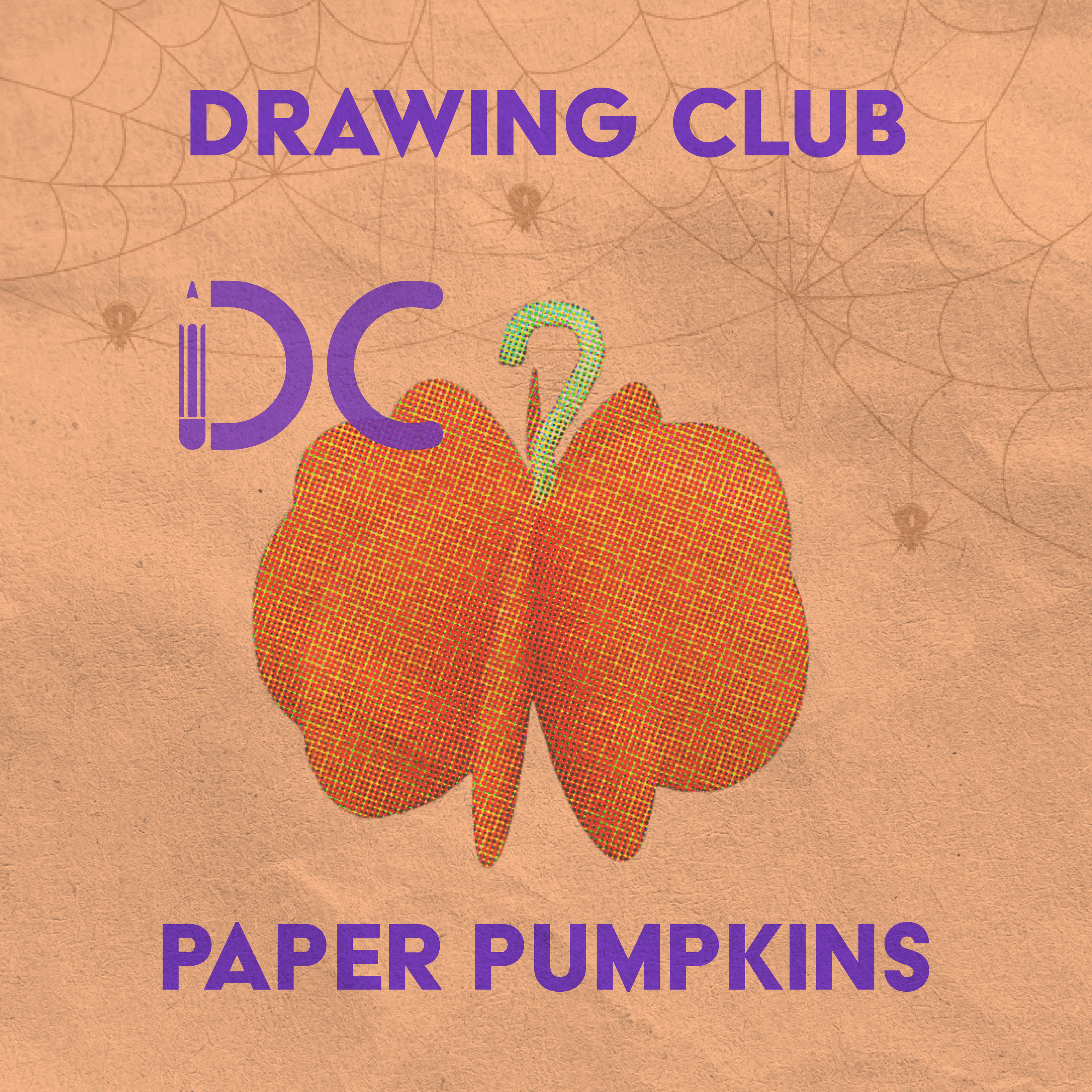
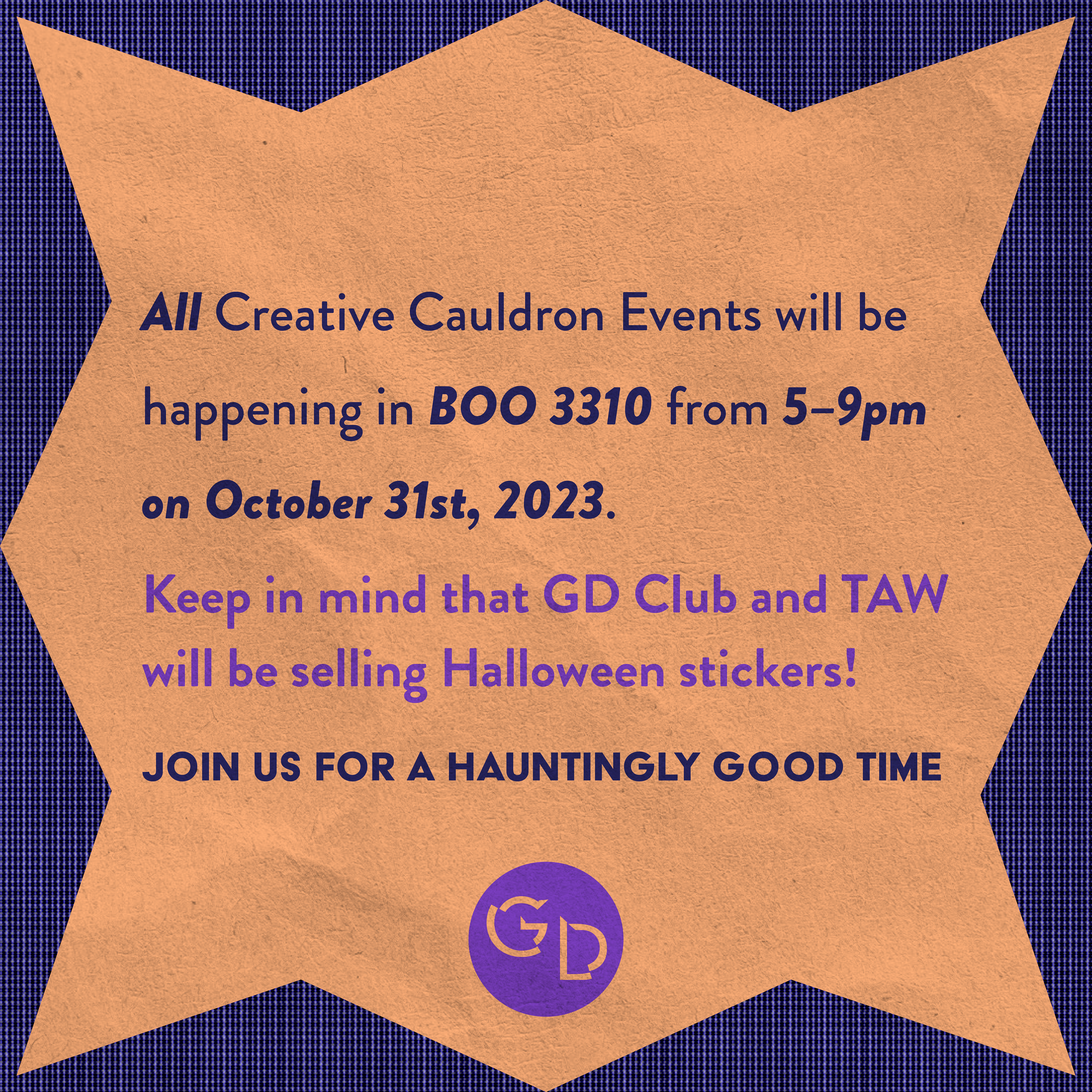
The social media team decided a fun way to keep viewers engaged with our content, is to adjust our visual identity to go along with the season and/or holiday that we are in or approaching. For example, in the fall and halloween season, we started to use the orange, purple, and pink as our color palette with teal, light blue, and navy being used as accent colors within our social media advertisements and assets.
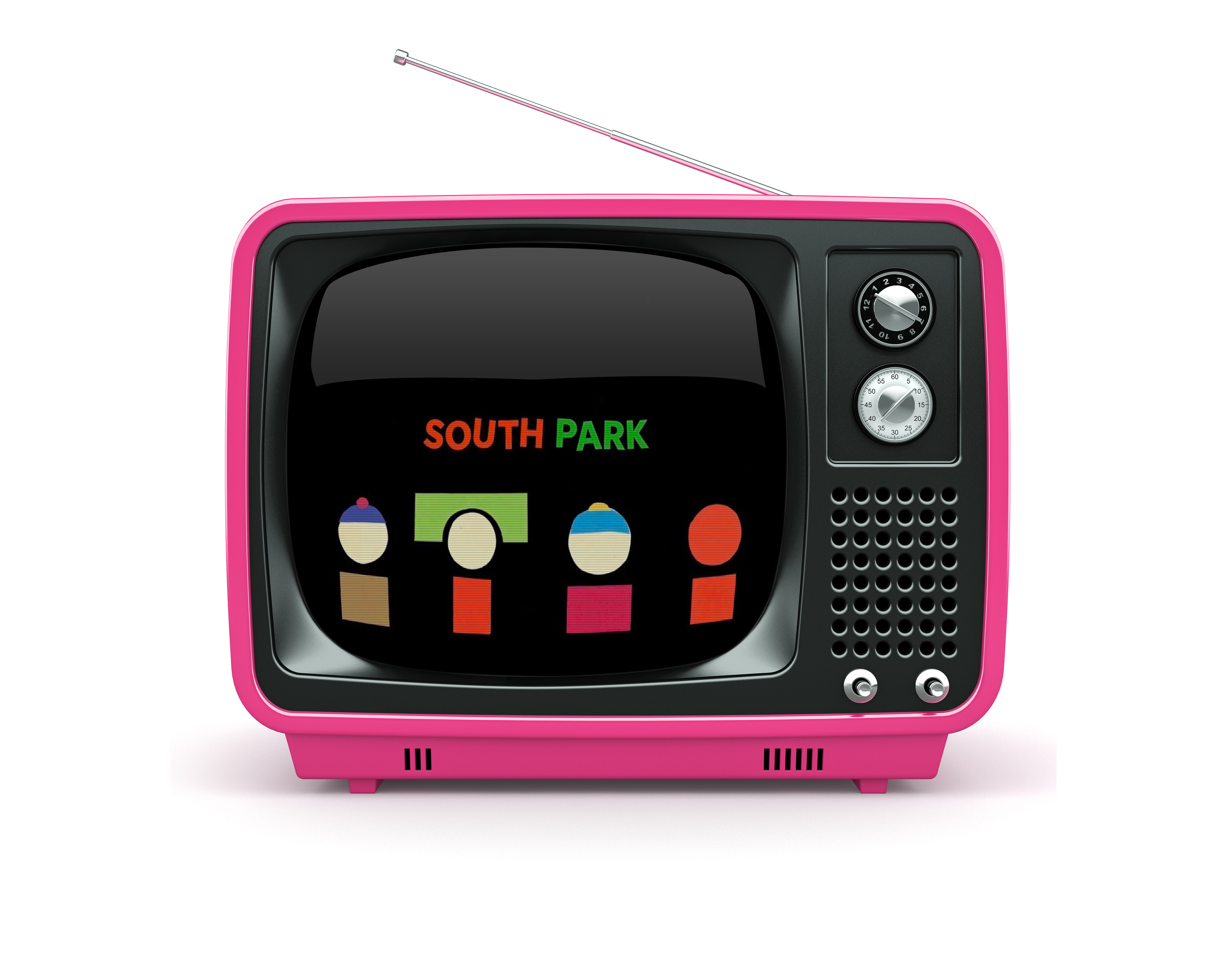
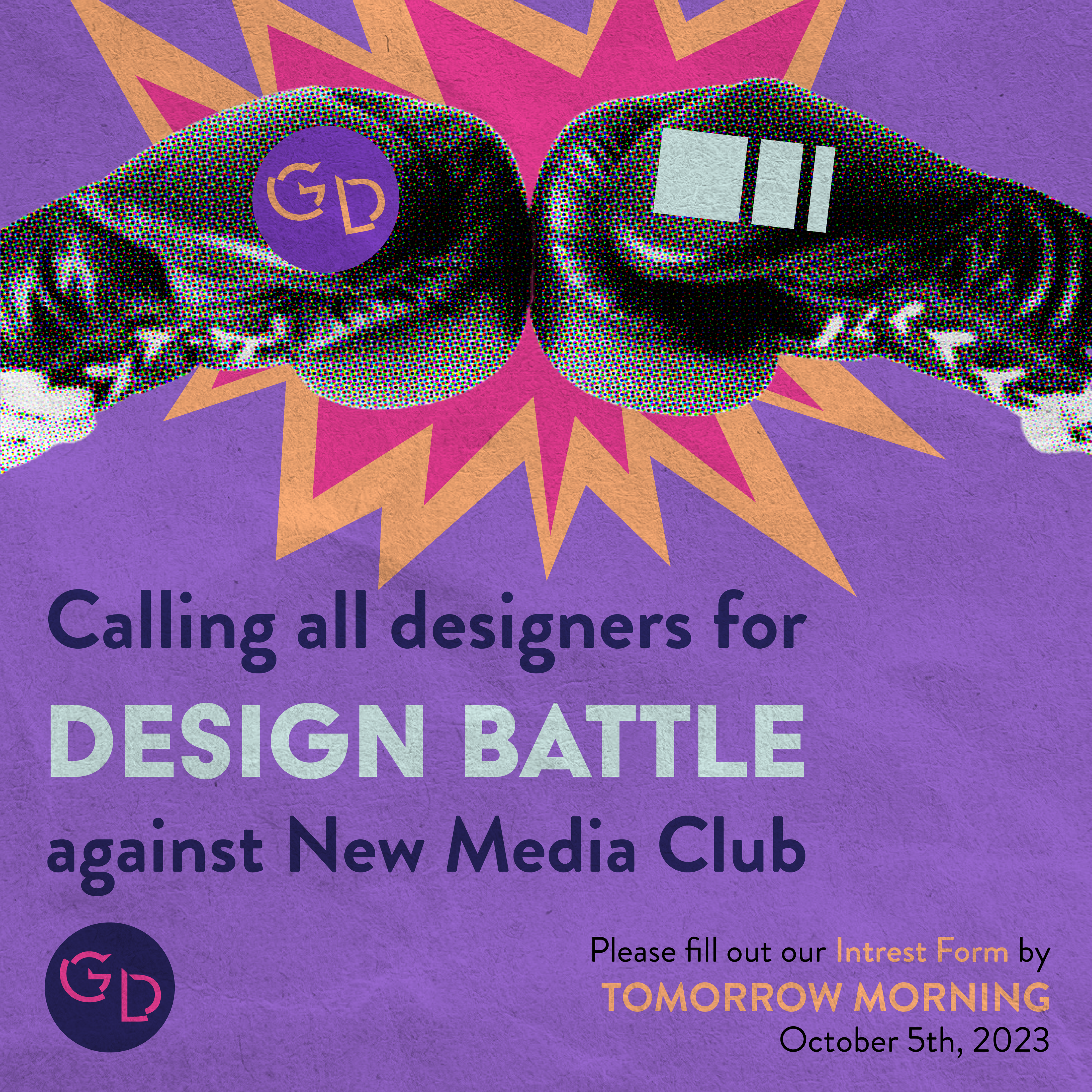
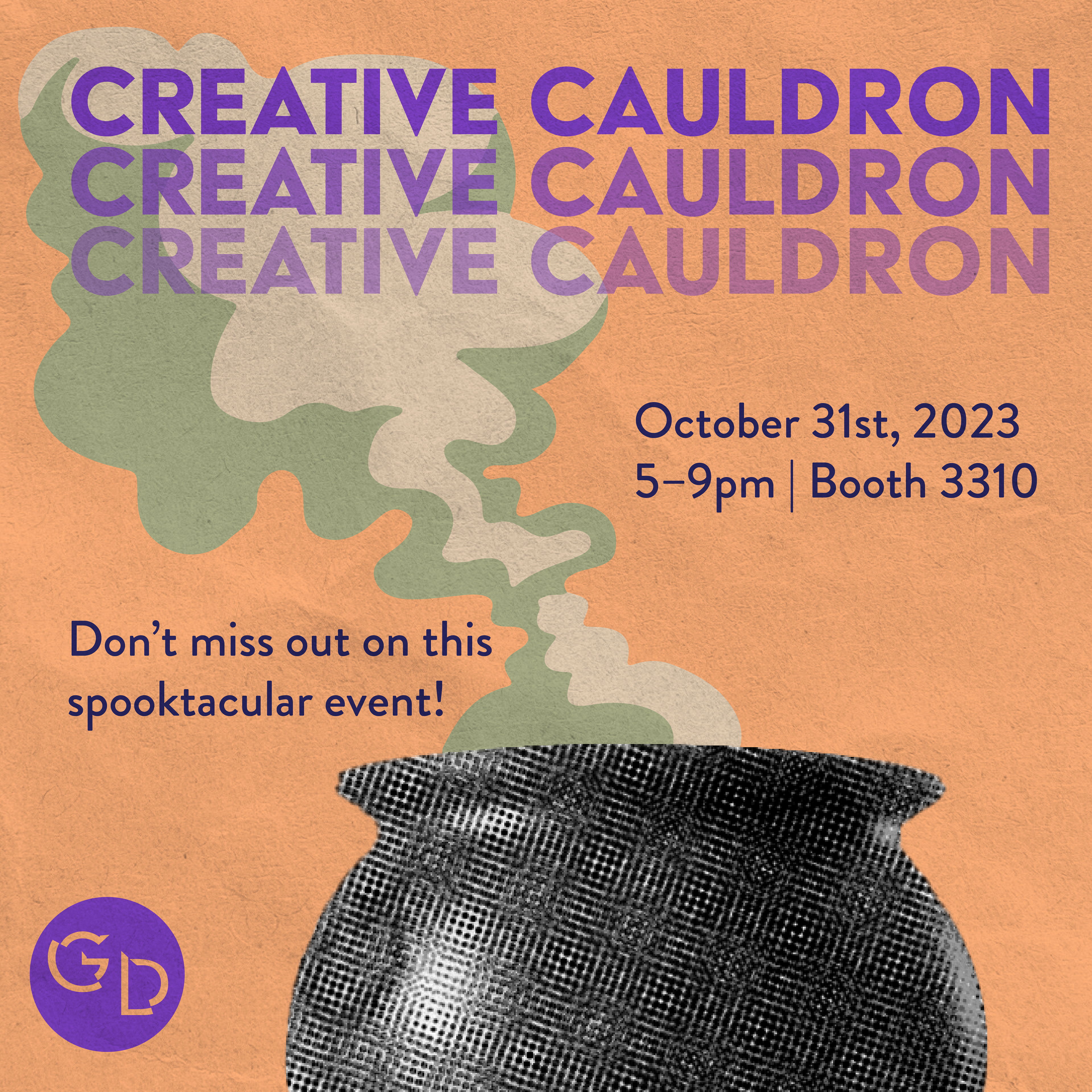
This was the first post created using the new brand guidelines; this set the stage for what is to come. I came up with the idea of using assets that pertain to the event being advertised, within each social media composition. This will cause more intrigue to the post, and will differentiate all of the events when looking at our page.
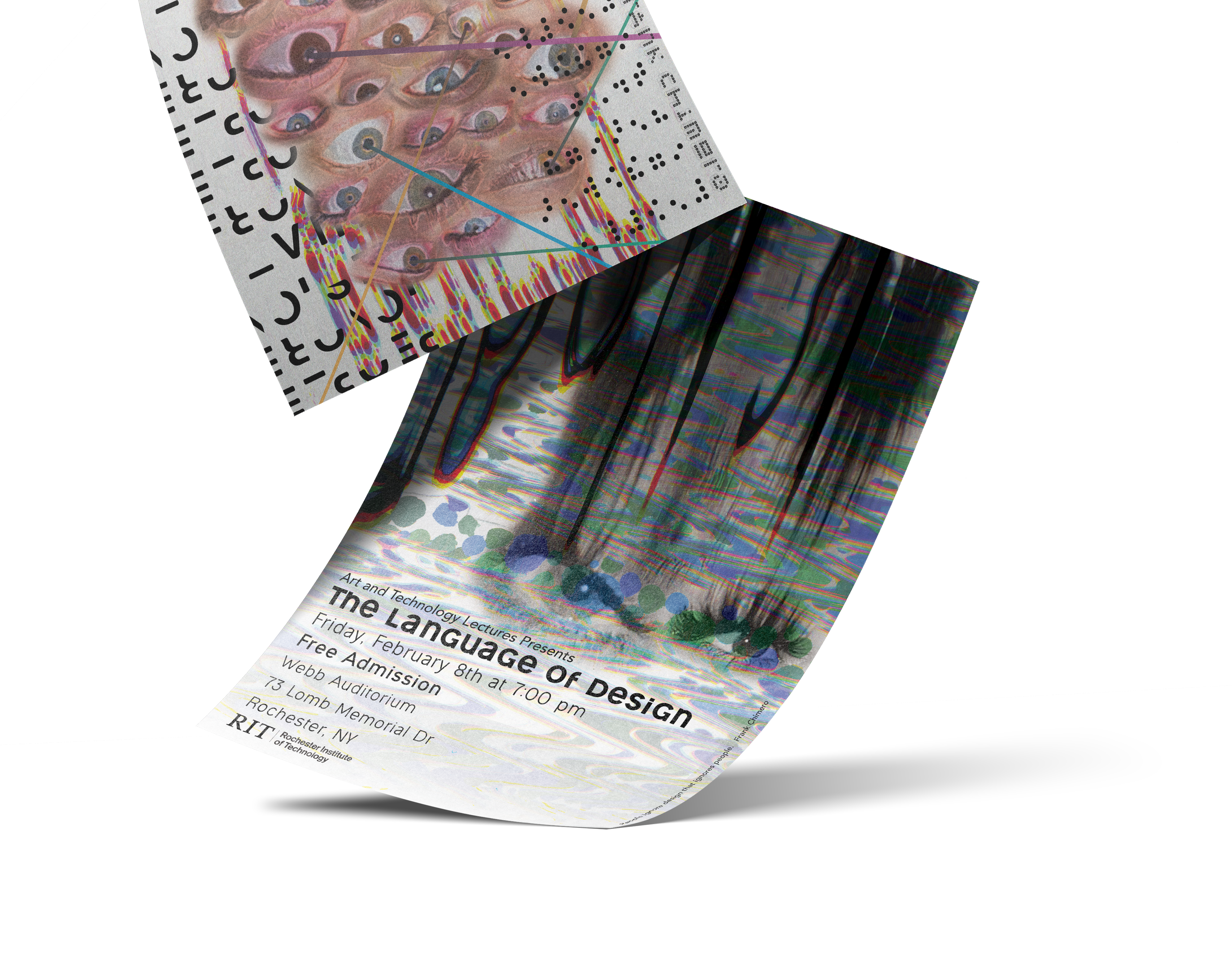
While designing the first post using our new brand guidelines, I thought that a paper texture overlay would be a perfect incorporation to the rebrand. Since we are in the digital age, texture is starting to be lost within design. Texture catches the attention of viewers, since they are so used to being shown flat designs everyday.
For this design, I used a scan that I made for my my Typography final, The Language of Design. This created the guideline of using black and white photos, whenever using photography. Doing this draws more attention to the information being provided, and adding an element of classic B&W photography.

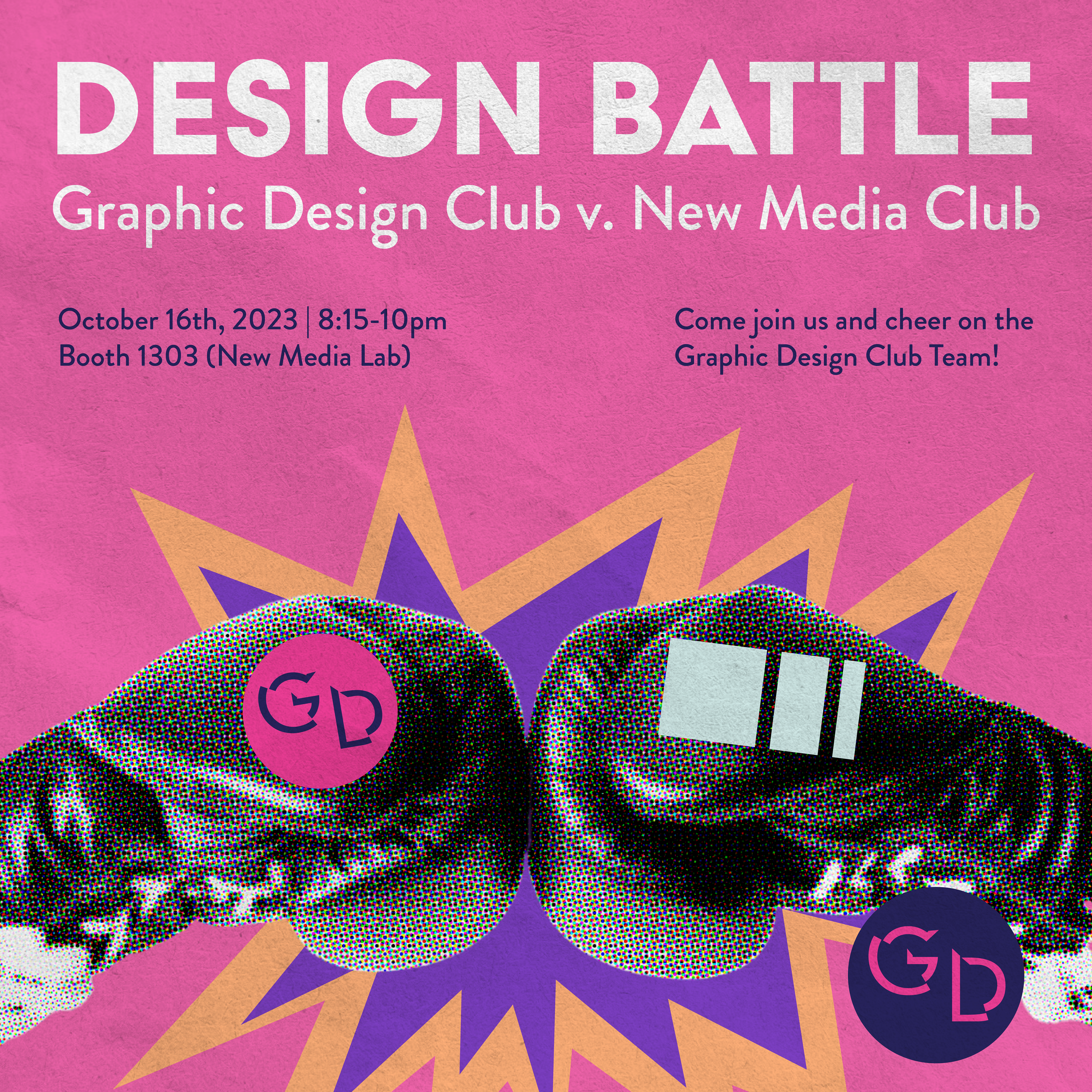
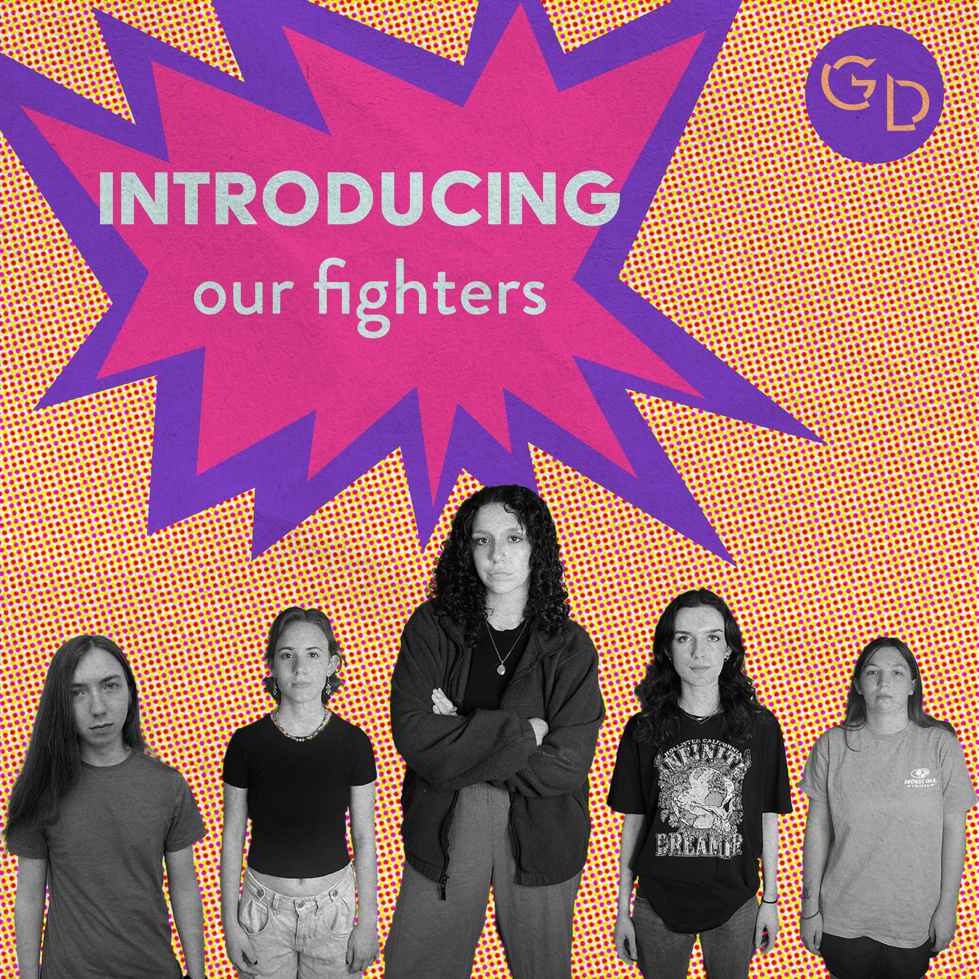
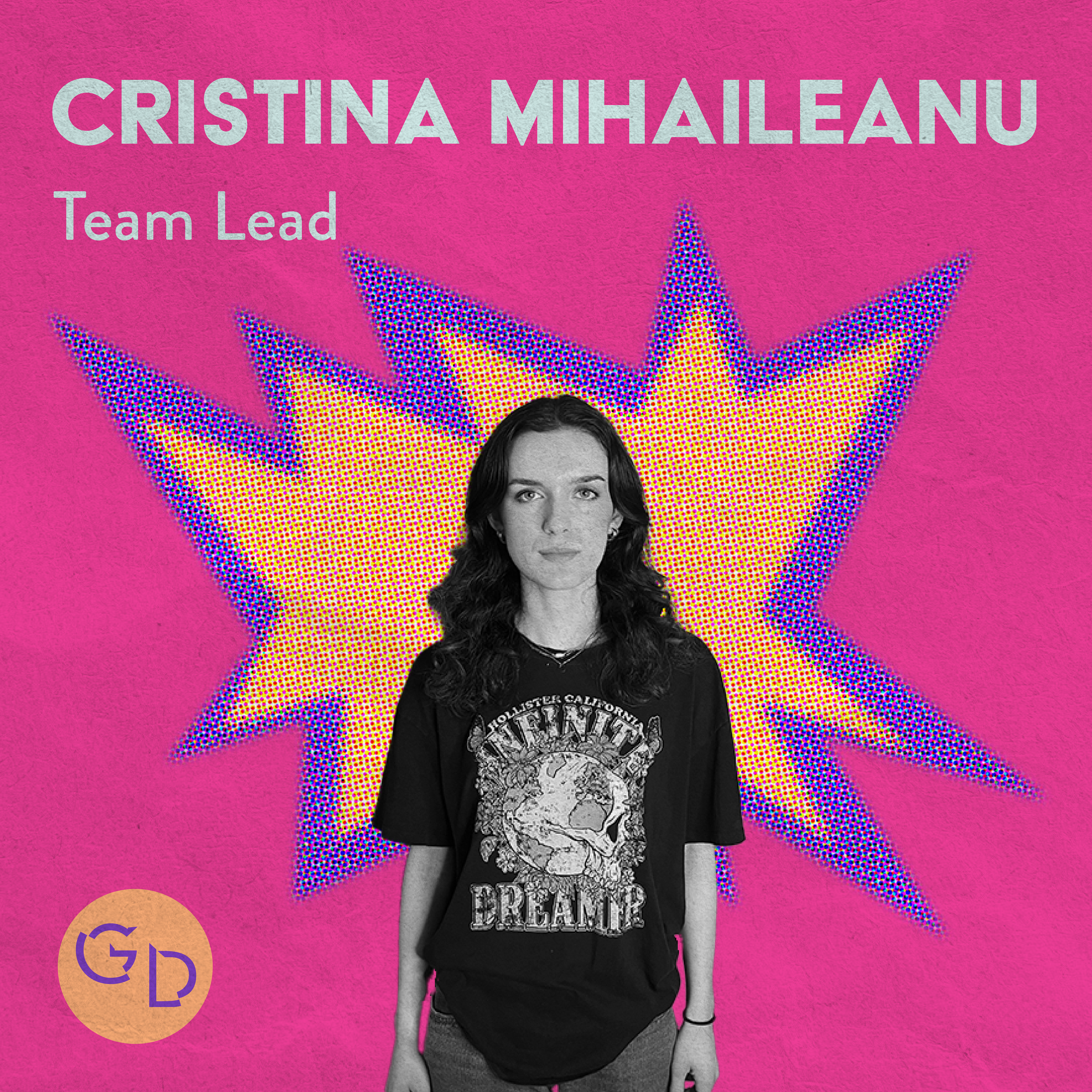
Design Battle Series
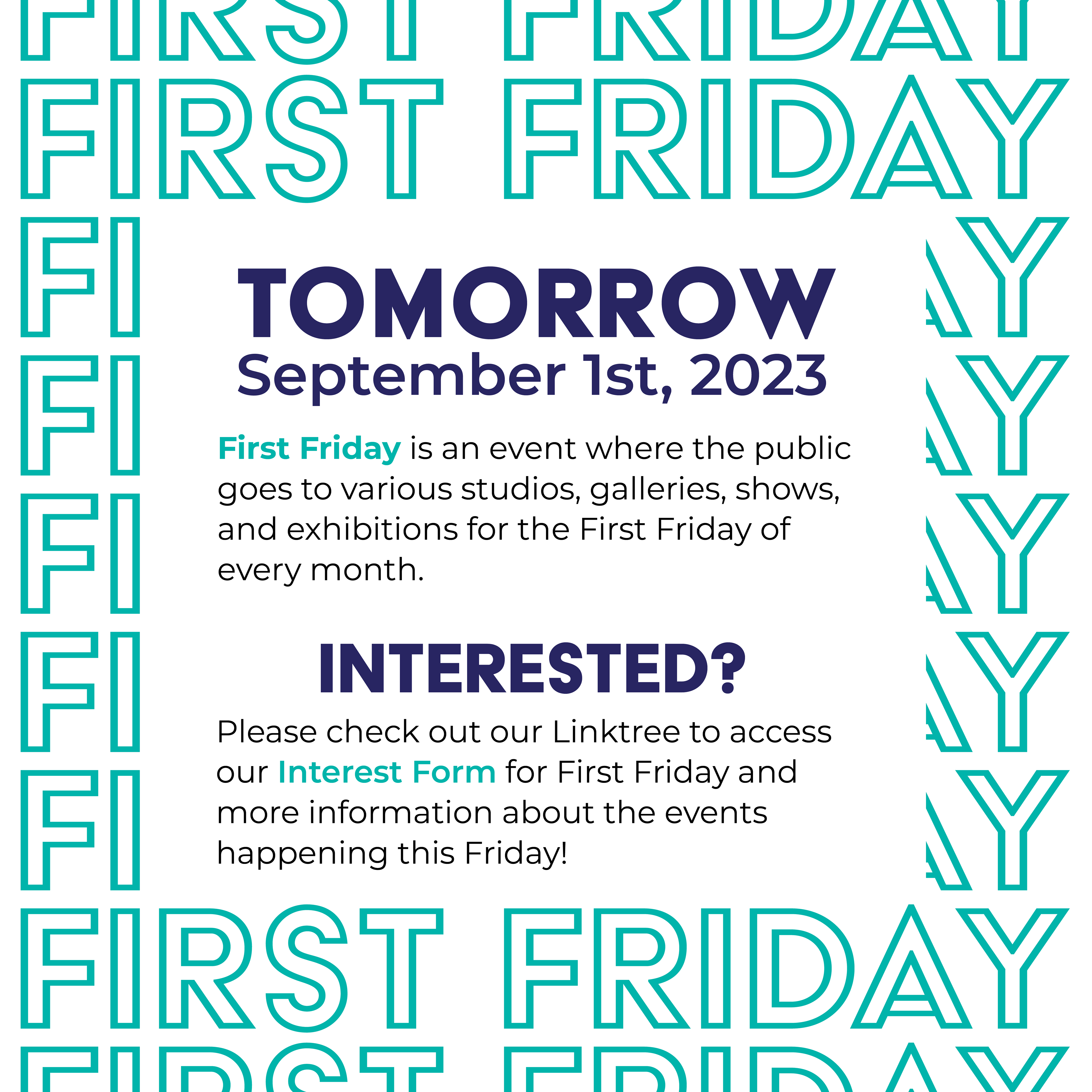
Announcement Post
Reminder Post

Creative Cauldron Series
Announcement Post
Event Announcement Post


Learn more about my extracurricular activities!