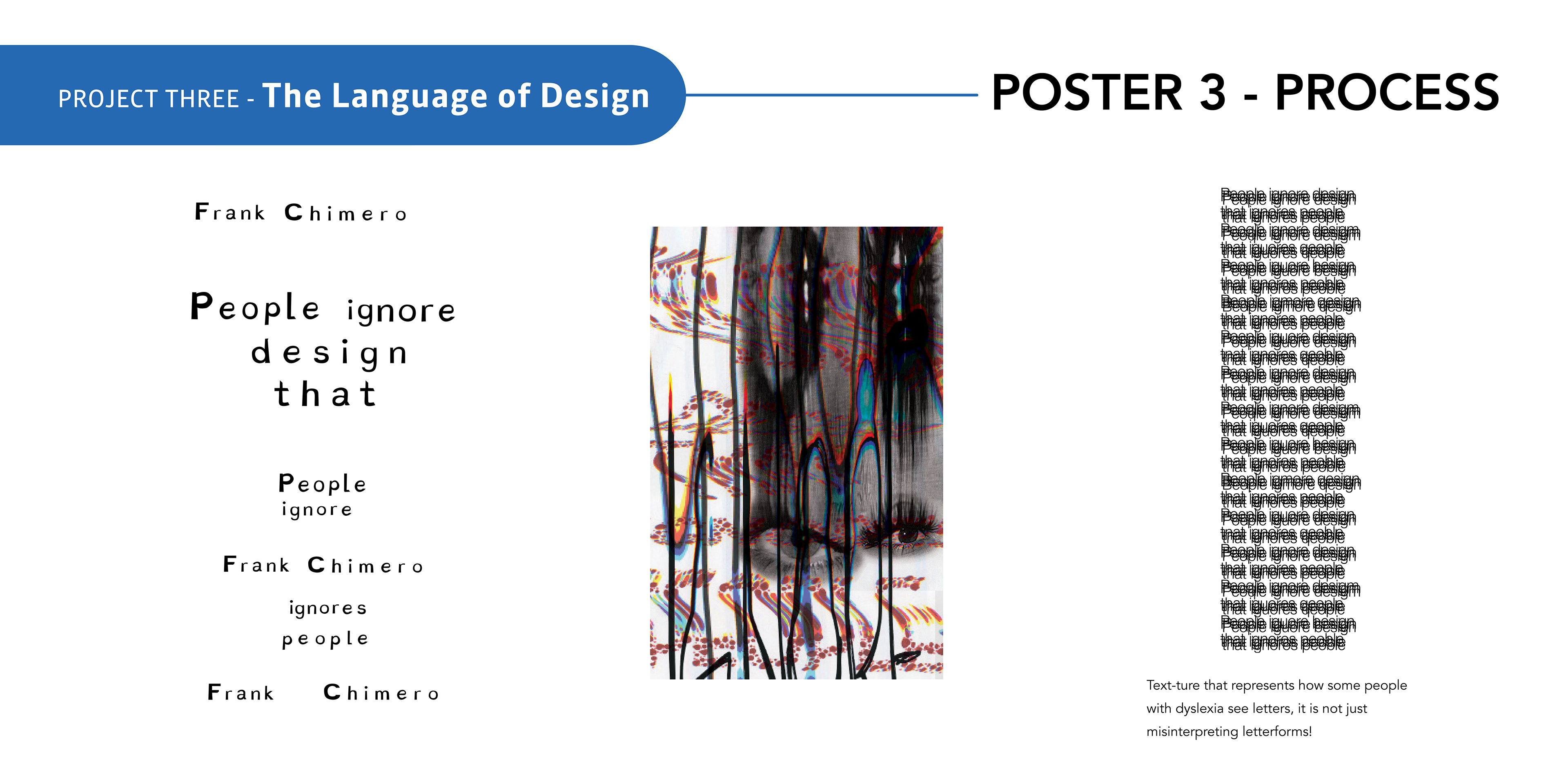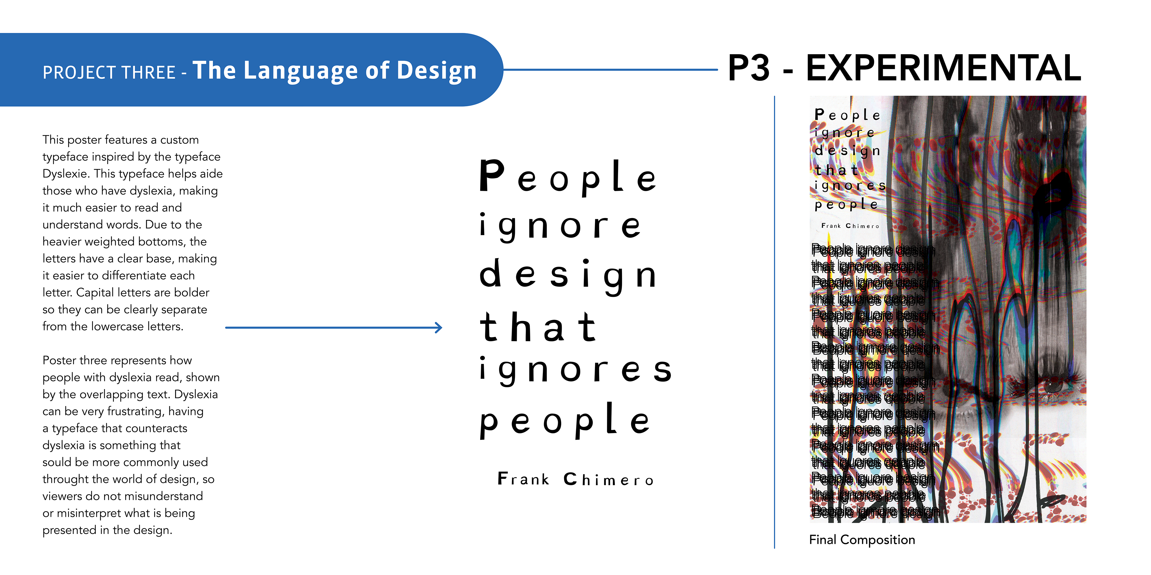

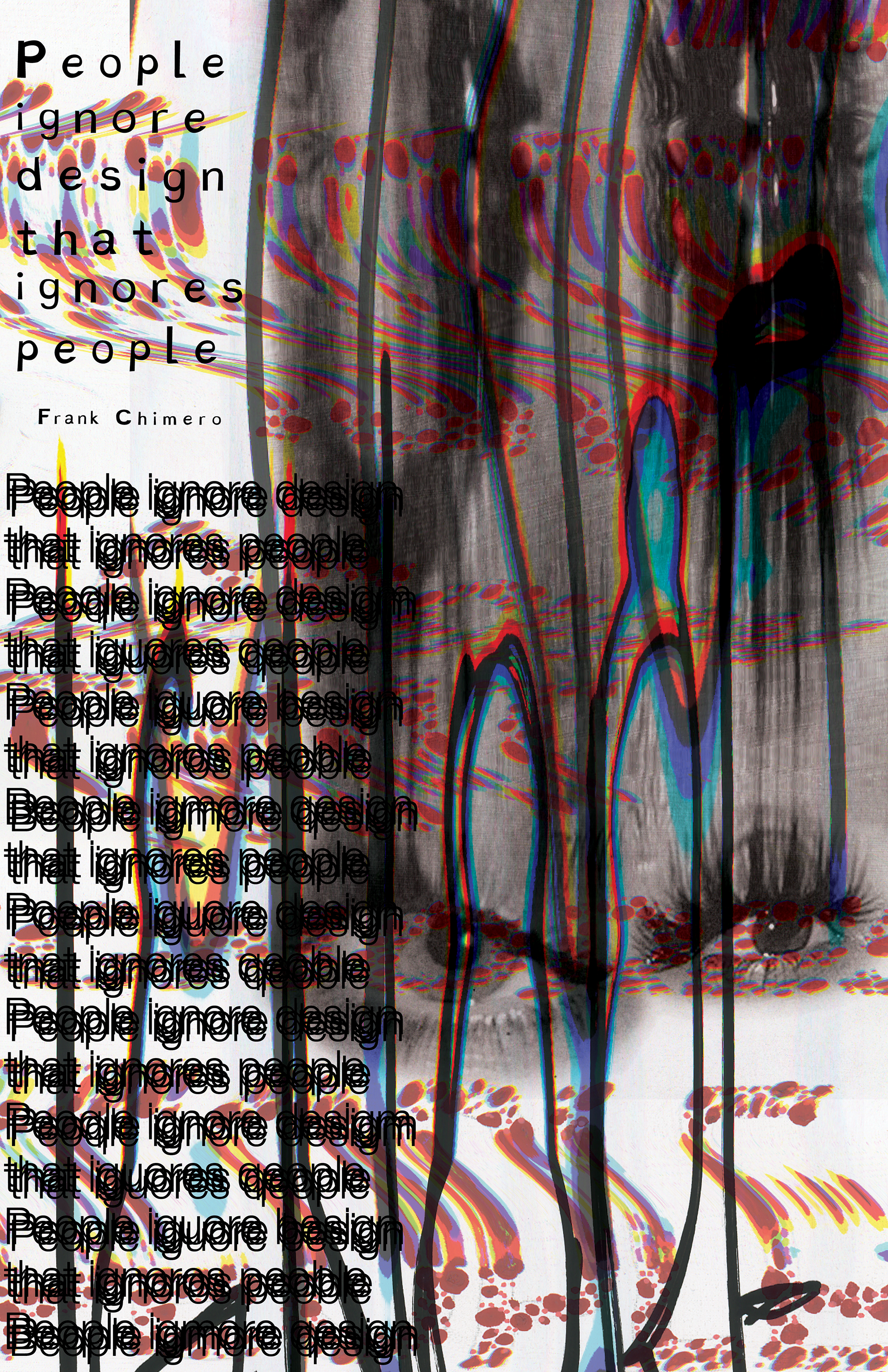
This poster touches on aspects of dyslexia and color blindness. On the left side of the poster, there are two different blocks of type. On the bottom, there is overlapping text to showcase how people with dyslexia read - it's not just misinterpreting letterforms! On top, there is custom typography inspired by the typeface dyslexie. This typeface makes it easier for people with dyslexia to read because of the heavier bottoms of the letters, this makes it harder for letters to flip and be misinterpreted.
The scans of the eyes, and a wavy layer of the Ishihara test featured in Poster 2, represent the difficulty of how people with these disorders have to go through life. Our job as a designer is to make information easily understandable, we need to accommodate to everyone's needs.
The scans of the eyes, and a wavy layer of the Ishihara test featured in Poster 2, represent the difficulty of how people with these disorders have to go through life. Our job as a designer is to make information easily understandable, we need to accommodate to everyone's needs.