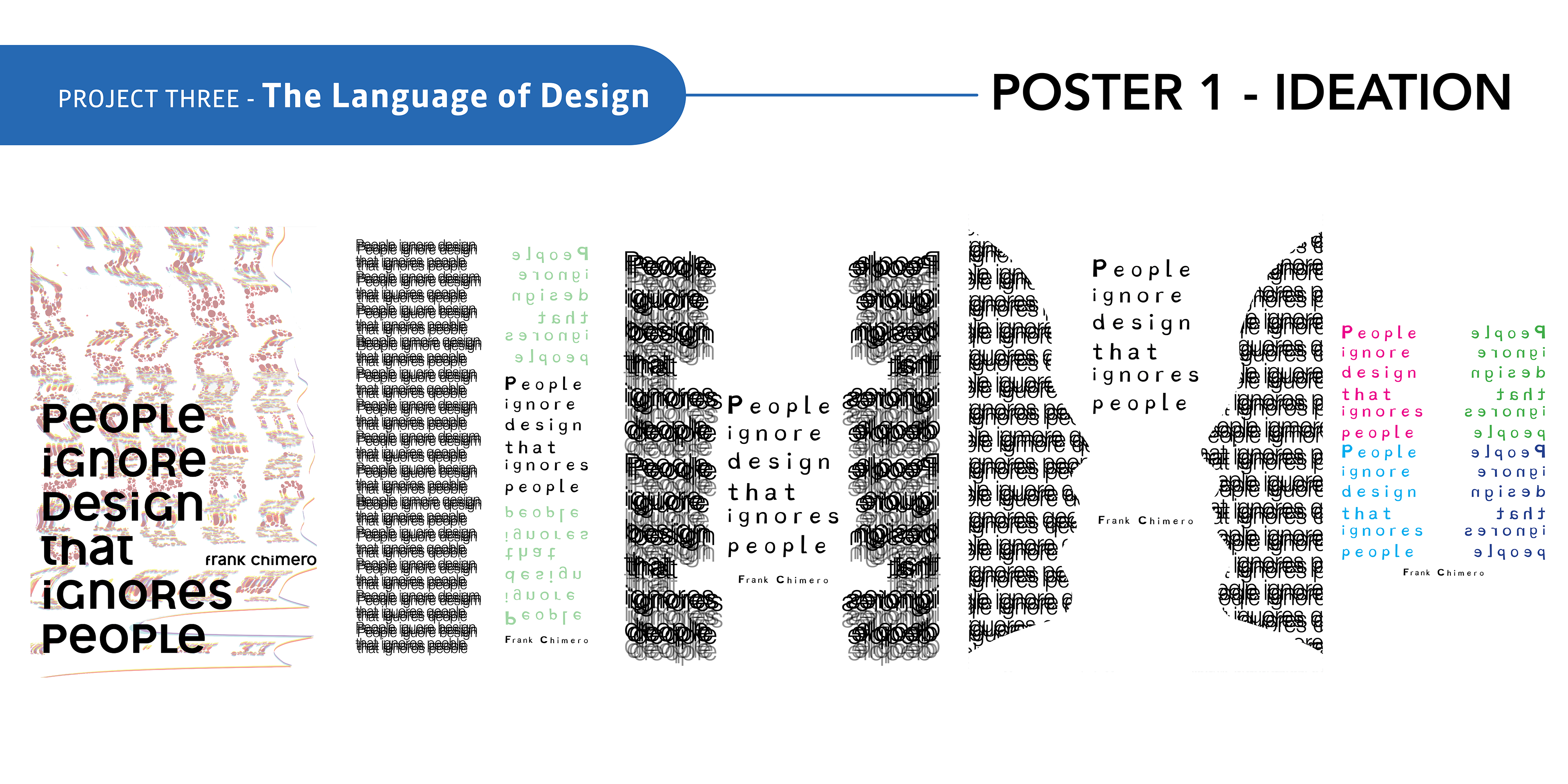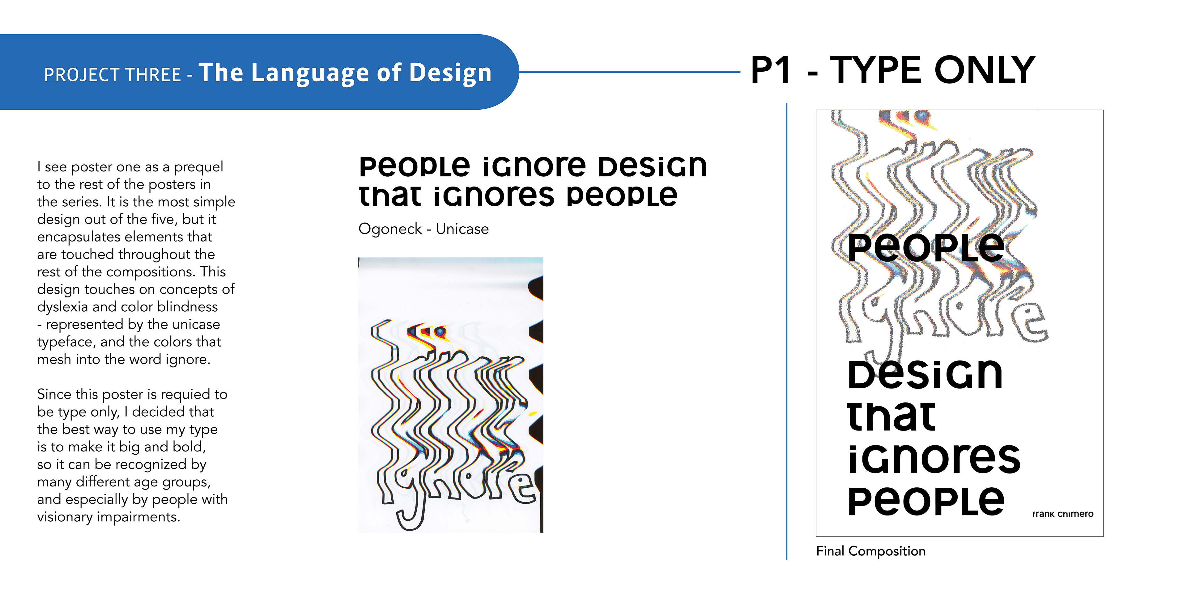

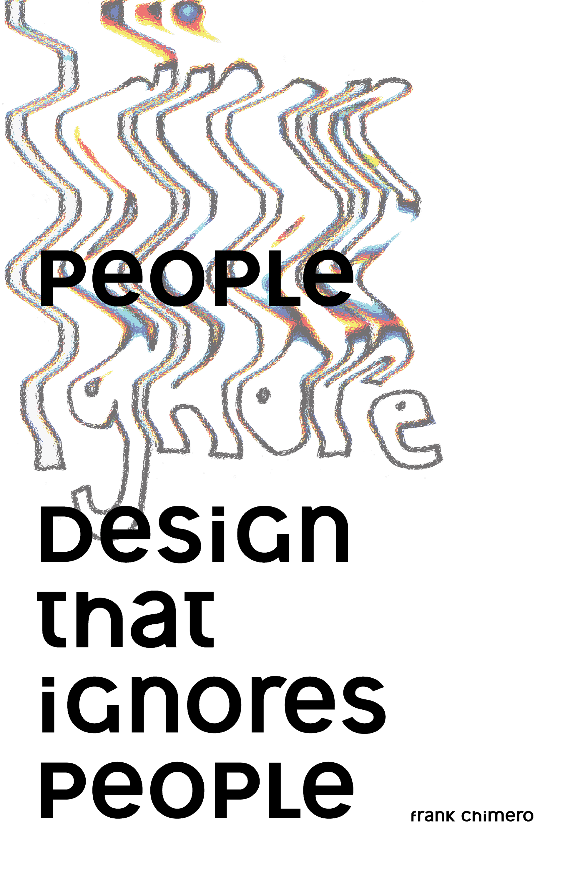
I see poster one as a prequel to the rest of the posters in the series. It is the most simple design out of the five, however it encapsulates elements that are touched on throughout the rest of the compositions.
This design touches on concepts of dyslexia and color blindness; represented by the unicase typeface, and the colors that mesh into the word ignore.
Since this poster was required to be type only, I decided that the best way to present my typographical elements is to make it big and bold, so it can be recognized by many different age groups; especially by people with visionary impairments.

Original Scan