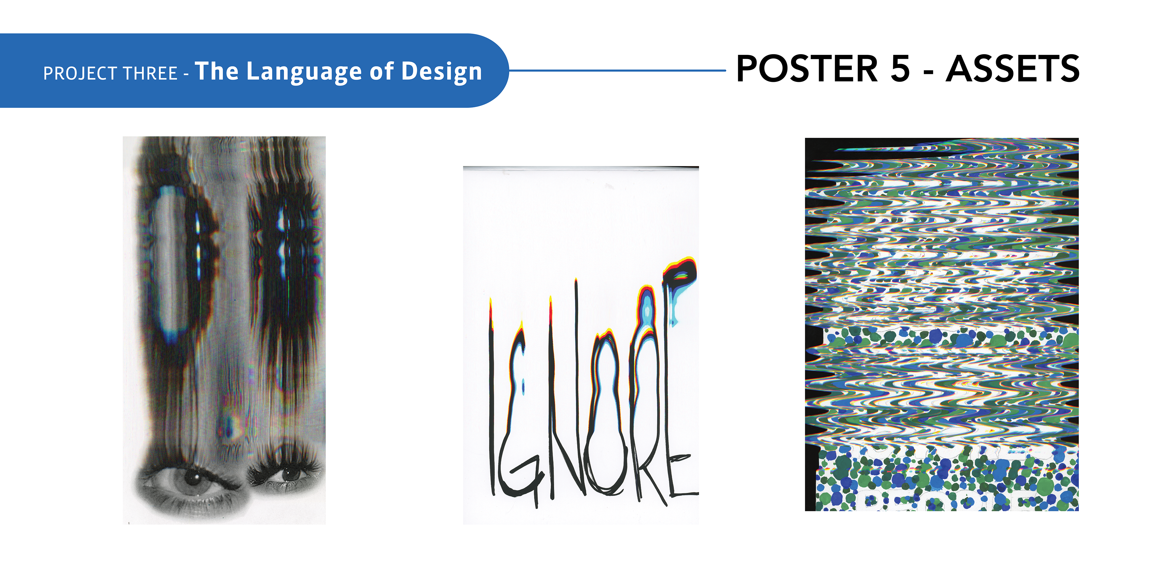

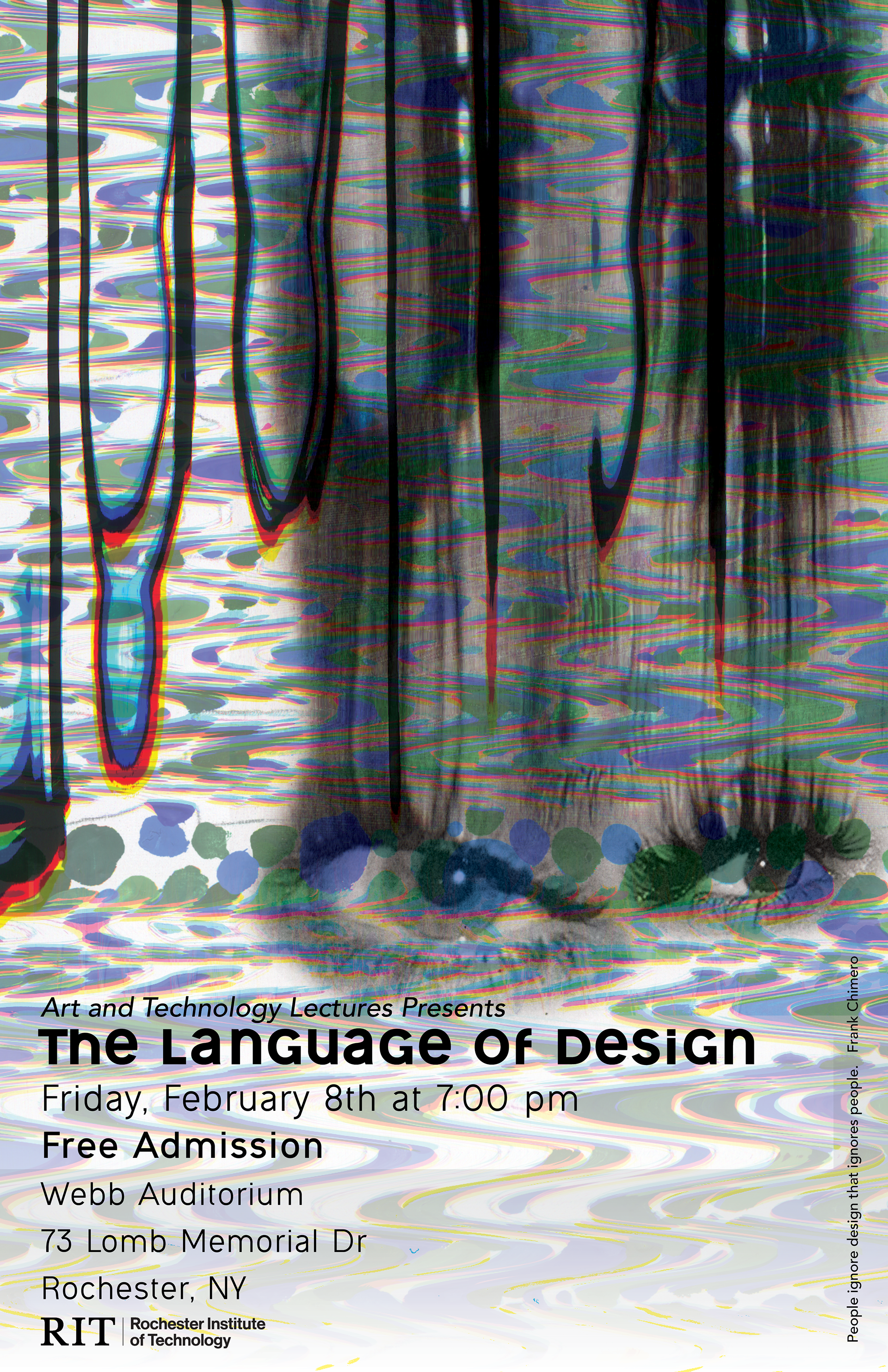
Since this poster was promoting an event, I decided to keep the visual elements to a minimum. I included elements I used in other posters to have a sense of unity between the five posters; including the eye scan, and the ignore scan. The background of the poster, is a scan of the other layer of the custom Ishihara test; I chose to use the cooler colors for the promotional to differentiate it from the other posters, which are all pretty warm toned.
I chose to keep the unicase typeface for the title of the event to keep with my concept of visual impairments, yet altering the letter "G" to make it read better. I included my quote on the bottom right corner to emphasize my concept even further.
I chose to keep the unicase typeface for the title of the event to keep with my concept of visual impairments, yet altering the letter "G" to make it read better. I included my quote on the bottom right corner to emphasize my concept even further.